APU Brand Voice and Visual Identity
Editorial Style Guide
In order to present consistent and accurate language, style, and voice to properly brand the university, we recommend using this guide as a helpful reference in university-wide efforts to maintain consistency in our language and style to align with our brand standards.
How We Want People to Think about APU
These are the qualities we want to be known for—how others perceive the heart and character of APU.
Christ-centered
Every message, decision, and interaction is anchored in our faith and guided by the truth of God’s Word.
Forward-thinking
We are continually learning, innovating, and adapting to meet the needs of a changing world.
Trusted
We are consistent, credible, and mission-focused—committed to academic excellence and spiritual integrity.
Transformative
We don’t just inform; we shape lives. Our rigorous education equips students to lead with character and conviction, to solve problems guided by integrity and competence, and to innovate to improve the world around them.
How We Want People to Feel about APU
These are the emotional takeaways we hope our audience experiences after interacting with our brand.
Welcomed
Our tone is warm, personal, and inclusive. We foster belonging in every corner of campus and every stage of life.
Empowered
Whether students, colleagues, or partners—we call people to step into their purpose with confidence and Christ-like courage.
Encouraged
We speak hope. Our message uplifts and affirms the God-given potential in others.
Inspired
Our stories and messages stir hearts to pursue a higher calling—one that makes an eternal impact.
Institutional Brand Guidelines
To ensure that every expression of the APU brand is on mission, crafted with excellence, and effectively tailored to your audience.
Institutional Logos and Brand Marks
If you are creating on behalf of the university, review APU's full brand guidelines before downloading logos.
Logo
Official University Brand Representation
The APU logo is our primary brand mark and should be used in most official and public-facing materials. The full spelling of the university name ensures strong recognition and credibility. The stylized “A” is formed by four stones—representing our Cornerstones: Christ, Scholarship, Community, and Service—with the cross at the center symbolizing the centrality of Christ at APU.
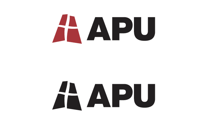
Monogram
Approachable, Relational Brand Mark for Broader Use
Designed for flexibility and approachability, the APU monogram offers a more relational way to represent the university. It works well in contexts where “APU” is clearly understood by the audience. Primarily used for internal communications, informal settings, and promotional materials, it expresses community, warmth, and school spirit—while staying true to the APU brand.
Email [email protected] to request APU monogram usage.

Seal
Exclusive Use by the President and for Signature Presidential Events
The university seal is APU’s most formal brand mark, reserved for presidential communications and official academic ceremonies such as commencement. Rooted in our heritage, it symbolizes our call to be a light to the world, our commitment to academic excellence and integrity, and the centrality of Christ in all we do.
The seal is available for use only by the Office of the President and the Division of Strategic Communication and Engagement (SCE).
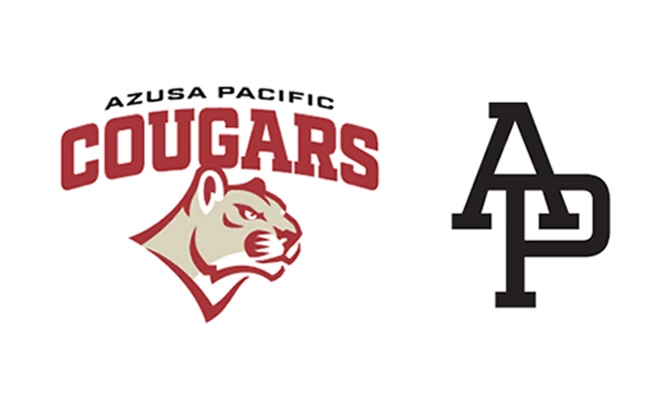
Athletics Logo
Exclusive Use for Athletics Brand and Select Nonacademic Contexts
Our athletics logos reflect the energy, pride, and spirit of APU’s athletics and student communities. Designed for competitive, student-facing environments, these marks capture the passion of Cougar Nation while reinforcing our broader brand. They are used within athletics and student belonging programs and on related merchandise, uniforms, and media.
Email [email protected] to request athletics logo usage.
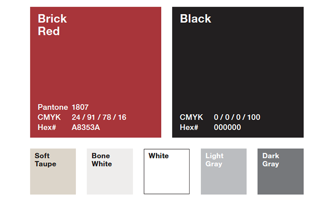
Colors
APU’s brand color palette is anchored by Brick Red and Black, with accent colors adding depth and visual interest to design applications. Complementary accent colors infuse a sophisticated energy, offering greater versatility for diverse design needs.
Brick Red: Pantone 1807, CMYK 24/91/78/16, HEX# A8353A
Black: CMYK 0/0/0/0, HEX# 000000
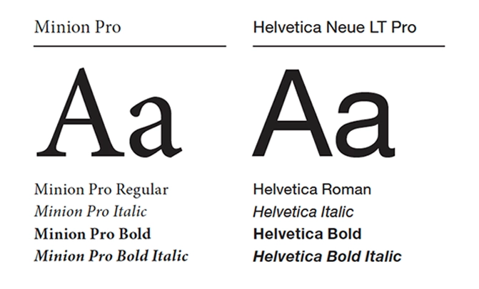
Typefaces
APU’s typefaces are highly legible, versatile, and timeless. Minion Pro brings sophistication and Helvetica Neue LT Pro adds modernity with its classic architectural forms. These typefaces complement each other with their varying weights and styles.
Minion Pro (Alternative: Times New Roman)
Helvetica Leue LT Pro (Alternative: Proxima Nova or Arial)
Join Us in Living the Brand
Explore tools and resources to ensure that every expression of our brand strengthens our connection to those we serve while advancing the mission and purpose of APU.